case study
Haydn Kino Cinema
How I Improved UX and Designed UI for a Mobile App of a Brick-and-Mortar Cinema

Client
Haydn Kino cinema in Vienna
Product
A mobile application
Team
Solo project (working with mentors)
Time
3 weeks
My role
UX design (~1/3 part), UI design (~2/3 part)
My tasks
Improving UX, creating a mood board, designing UI, native iOS specialization according to Apple’s Human Interface Guidelines, high-fidelity prototype, style guide, user testing, stakeholder presentation, storyboarding
Tools
Figma
Project overview
The client
Haydn Kino is one of the very few cinemas in Vienna that screens original versions of blockbuster movies. It is located on one of the longest and most famous streets of Vienna, Mariahilferstraße, and was built in 1917 in the basement and ground floor of a coffee house that had a restaurant and bar license. Today the cinema also offers tasty snacks and popcorn and is highly frequented by people who prefer to watch movies in their original language, without dubbing.
The product
Because visitor feedback showed that there would be a high demand for purchasing tickets through a mobile application, the case of Haydn Kino served as a good base for a semi-mock UX/UI design project.
The team
I am glad I was able to work on a mobile application for Haydn Kino cinema as a participant of Brainster Vienna’s UX/UI design bootcamp. I have worked on this project solo with the help of mentor-instructors acting as stakeholders and researchers. My role was mainly covered by UI design, but I have also touched on UX design at several points.
Discovery
The kick-off
I joined the process when a UX researcher and a UX designer synthesized and delivered their findings to the UI designer. They provided me
- a client brief,
- user tasks and key findings based on user interviews,
- user personas, preferences,
- premade black and white wireframes as images (24 screens).
Key findings of the research
- Vienna is a multicultural city and a lot of people do not want to watch films in German. There is only one other alternative for original versions, which means Haydn Kino is pretty crowded.
- Users would like to have a better overview of current and upcoming movies. Because most users who buy their tickets online, use their mobile phones, a mobile application for buying tickets would be warmly welcomed. Since the cinema is located in the basement, internet connection issues are problematic for ticket scanning, so it would be important to save the purchased tickets in the app and make them available also without network access.
- The biggest frustration in the cinema is the long queues. Customers have to be there 30 minutes before the movie starts. Even users that manage to buy their tickets online, have to wait a long time if they want to buy snacks. They can only pay for snacks with cash and taking the order and paying takes a long time.
The design process
My role in the project
I have worked on this project in two phases, twice a week and a half, having a break in between.
Phase #01
In the first phase, I built the wireframes in Figma and created and implemented a general concept for UI, linking the screens into a prototype. My main focus was on getting more familiar with the UI elements and getting more hands-on experience in the design software itself using components and styles.
Phase #02
In the second phase – after conducting user tests of the initial design -, I revised and partially redesigned my previous work. I also thoroughly studied Apple’s Human Interface Guidelines aiming to create a more native iOS application. Also, in this phase, I made several minor improvements regarding UX and added new screens to the app to make the interactions even smoother.
UX design
Some of the problems and their solutions
Revised user journey
The primary purpose of the application is online ticket purchasing, so its task flow has great importance. It is a linear process consisting of four phases: 1 – selection of tickets, 2 – selection of seats, 3 – selection of snacks (optional), 4 – payment. According to the original wireframe, users could start this process only at the Box Office screen.
However, testing the prototype revealed that users intending to purchase a ticket belong to two main segments, and one of them has to take unnecessary extra steps.
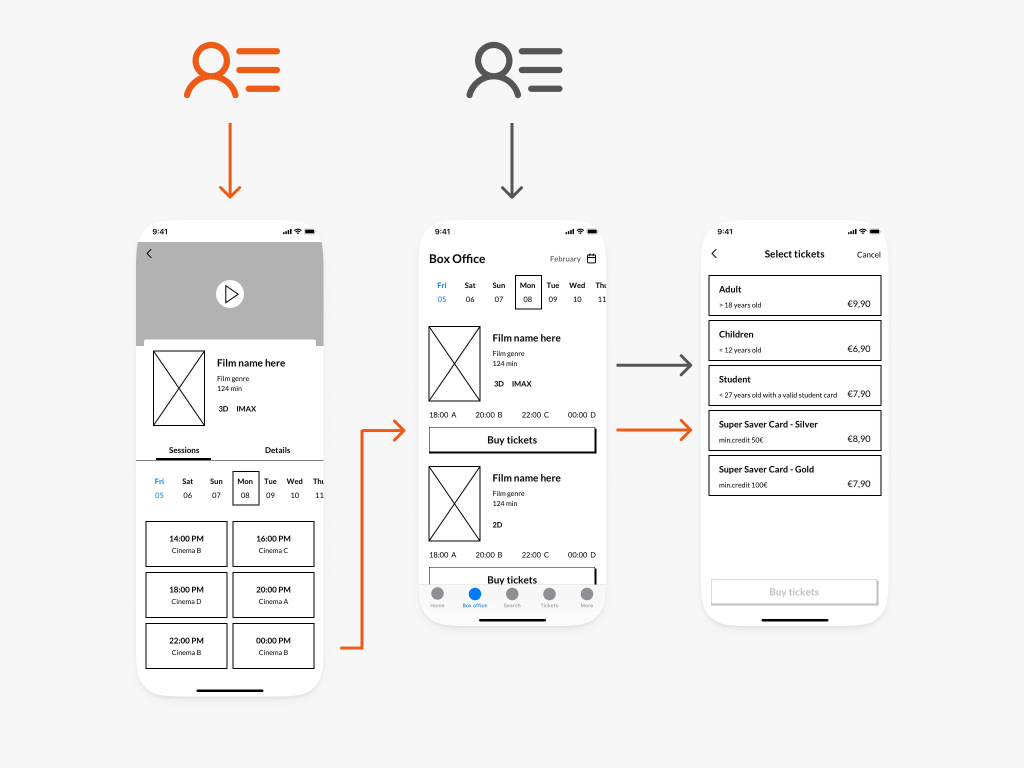

“Segment A” (the “ones having a day off”) only gets to go to the cinema on certain days. Their logical user flow is to filter by date on the Box Office screen and select the movie they like. This is the original solution in the wireframe.
“Segment B” (the “movie hunters”) know which movie they want to watch, though they are not tied to specific dates. The logical task flow for them is to go from browsing the films to the chosen movie screen. They check when the movie will be shown, and in case of finding a suitable session, start buying tickets. However, the original wireframe has not provided this option and has led the user to the Box Office screen instead. It was an unnecessary and annoying extra step in the user flow. Luckily, I could solve this by adding the “Buy tickets” button to the movie screen.
More straightforward ticket selection

In my solution, I kept the original idea of having the users first tap the card of a ticket or a snack. It does not cause much cognitive load to realize what to do when users see a list of cards. But after that, I rejected the implementation of the trash can. Instead of that, I incorporated a more obvious +/- input stepper into the card. (Obviously, after selecting at least one item, tapping on the card itself does not function as “adding one more” anymore. Users can select/deselect the item only with the help of the steppers until reaching the initial empty state.)
iOS specializations
-
According to the original wireframe, users would have been asked to register/sign in right after the app launches. However, part of the content is perfectly consumable even without using the profile-related functionalities (e.g., checking which movies are showed or coming).
I changed the sequence of the screens and presented the option of registering, signing in, or proceeding without action later, right before the payment procedure. This solution is more aligned with Apple's HIG suggesting asking people to sign in only in exchange for value and delaying sign-in as long as possible. Also, Apple recommends implementing their native methods for authorization, so I provided "Sign in with Apple" as an alternative and Apple Pay as an optional payment method.
- Another significant change compared to the original wireframe is applying a segmented picker on the "Movies" screen, containing categories as "New releases", "Now showing", and "Coming soon", showing the films in a carousel under each. This change reduces the amount of vertical scrolling required and flattens the entire information architecture, a characteristic of Apple structures.
- Similarly, I have not implemented overcrowded upper "bars" offering more options (such as snacks or payment options) to choose from and added new screens instead to manage the process of selection with Apple's representation of lists (so called "table views").
UI design
Look and feel
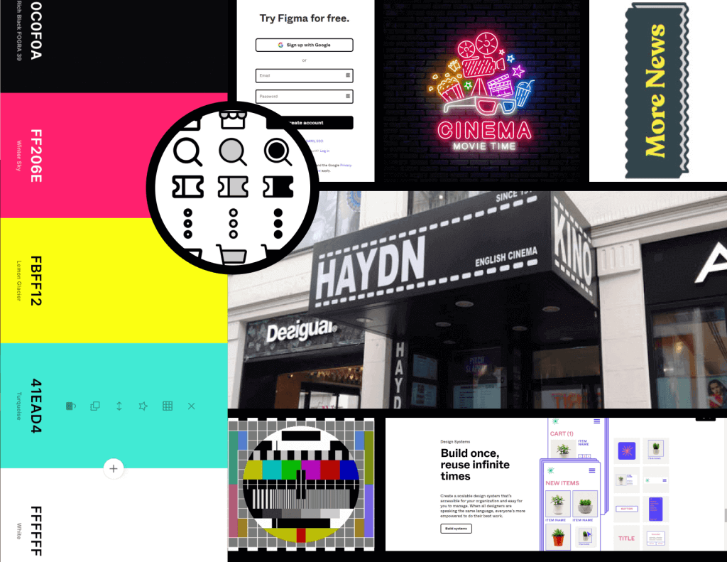
Mood board
Of course, after gathering the first inspirations, I gradually changed and polished the design during each work phase, but some concepts persisted until the final version.
Final design
Feel free to walk through the final design with the help of my Figma prototype.
Delivering the design
Stakeholder presentation
To conclude the project, I pitched my work as a “formal” stakeholder presentation. Our mentor-instructors acted as stakeholders of different business roles, and the goal was to persuade them to buy in the design I created. My presentation also included a storyboard as well as an outline of further opportunities related to the app.
Possible paths for development
Based on the usability tests I had with the prototype, some other user issues and ideas showed up, leaving room for further development.
- There was a common demand for releasing a web and Android version of the application.
- The possibility of buying tickets to more movies at once is missing from the MVP, but maybe it would be worth adding later, expanding the shopping cart function.
- The feature of sharing tickets with other app users would receive a warm welcome. In this case, both members of a couple would have their tickets equally at hand, and no matter which one arrives at the venue first, they could immediately pick up the pre-ordered snacks.
Handoff to developers
Part of closing the project was to prepare the design for the developers, so I created a style guide to make the transition between the different work phases as smooth as possible.
Learnings
Thoughts & learnings
In addition to a deeper understanding of Figma, as well as UX and UI issues, this project also contributed greatly to getting to know myself better as a designer.
Realizing personal role preferences
I realized that I prefer working as a UX designer or as a combination of a UX/UI designer. This project revealed that I can not handle UI separately from UX and even if I have to focus mainly on UI, I am pretty sure I am going to wear my UX-er hat and won’t be able to restrain myself from tackling UX-related issues as well.
Need to work closely with the team
Similar to the previous point, working on this app highlighted for me the importance of constant and mutual communication between the members of the greater team that got involved in the project. Since this was a semi-mock project where I have received a brief and some premade wireframes beforehand, I could not have live meetings with the UX researcher and designer working before me, and sometimes that was a frustrating experience.
Killing my darlings sooner
When I was working on UI design in the first phase, I was too immersed in the possibilities offered by the different styles to notice: I went too deep without correct validation. I had a concept I liked, and instead of starting to test it as soon as possible and collecting feedback in small chunks, I became too immersed in the details.
After I started testing and got a bit of distance from my work between the two phases, I realized that I had to carry out a great dose of modifications to move forward. These changes were very painful because, at that point, I already knew that I could have avoid the extra work if I had killed my darlings sooner.
Let's get to know each other
Do you feel that by working together we could make the world more beautiful, more fun and simpler? Do not hesitate for a minute, write to me! I am here and looking forward to hearing from you about your latest ideas, plans, and pet projects. Or your foolproof recipes. I am an awful UX designer when it comes to cooking.
 by Lilla Kisbéri-Varga